Wednesday, October 3, 2018

On the Campaign Trail


This year, I had the opportunity to create some campaign materials for a local candidate. What was created for her were a Facebook cover, logo, and a campaign sign. She wanted to give the message that they would represent everyone in their district regardless of party affiliation. She wanted blue, red, and purple. I thought of using a map of her district in either her sign or logo or both. 

The logo was created and approved first. The approved design was provided in full color and gray scale for print; full color for social media. 


By the time we got to her sign she had decided on red, white, and blue for the colors and ultimately, instead of the standard rectangular sign, she wanted a round shaped sign.

People often don't know how many iterations of a design are considered before a decision is made. The complete and final design can appear so simple like the Nike swoosh and people wonder what all the fuss is about. 

Here are several iterations of the campaign sign before approval.


Sign that was approved. When a design for print has been approved, I like to work with the client's chosen printer to get the printer requirements. I've done posters, business cards, brochures, and banners. Sometimes the printer wants a pdf and sometimes they want the native file. In this case, the print shop wanted the native file with "create outlines" using the PMS color system. 


The Facebook cover was the last item created, using a photo supplied by the client and a similar theme to the campaign sign.


The whole project took about 4 months from contract to completion.

Friday, July 21, 2017

You Don't Have to be a Professional to do Our Posters

Recently, I had a client, who, in all seriousness, told me that you don’t have to be a professional to do their posters.

Huh.

I thought about a project I completed last year.

It was an event poster for a winter concert, Christmas songs that were all about journeys – Mary and Joseph traveling to Bethlehem, families traveling to visit relatives.

The organization’s representative was in a quandary on how to represent the spiritual and secular journey on the poster. They suggested just do text and no graphics because they couldn’t think of how to visually both. They didn’t think that splitting the poster in half with an image of Mary and Joseph on one side and a family’s journey on the other would work. I explained that you don’t have to be that literal. We talked about the theme “The Journey”. They talked about some kind of movement or sense of movement, perhaps a comet? Maybe a visual of a snowy path through a winter woods would work? I responded with “Let me see what I can do.”  

Thinking about the title of the concert “The Journey” and what a journey means, I thought that the message for this concert isn’t about the journey but the destination. What I came up with captures that sense of journey to a place while at the same time giving the feeling of something beyond the physical world.

And this takes me back to “you don’t need a professional…” I put it like this: clients have limited tools in their toolbox. They might use bullet points, italics, or bold to highlight text. They might use clip art and center everything. The basics of graphic design and having an eye for composition isn’t there. The ability to see any number of possibilities to visualize their message isn’t there.  

When a client expects the designer to do what they are told then they are not allowing the designer to do their job and the possibilities are lost.

A professional will think and imagine something the client would never think of. Telling the client that they don’t know what they are doing is problematic. Explaining that this isn’t their area of expertise; that it’s the designer’s job to come up with solutions can be misunderstood. Depending on the client, this could come across as having a big ego.

But if I had done what I was told, the first idea presented to me, the client would have had a poster with only text and a logo. They wouldn’t have a poster that they loved and caught the attention of the public.

“You don’t need a professional to…”

Then you don’t need a graphic designer or commercial artist.

Wednesday, November 30, 2016

Freelancing and Marketing

I believe the hardest part of being a freelancer is marketing oneself. I know I would rather be concentrating on the creative work, designing dynamic and engaging websites, brochures, business cards, and posters for clients. But in order to do the work for clients you have to get clients and that means selling yourself.

I asked my contacts on LinkedIn for tips that would help freelance designers. Feedback came from recruiters, fellow graphic designers, design firms, and marketing experts.


The tips and suggestions given I’ve broken down into three categories.
Branding/Identity/Message
Networking
Services

Branding/Identity/Message

This would be whom you are and what you offer that others don’t. It’s how you present yourself to the world online and in person. Some people call it “your story”.

Sammie Watson (Aesthetic Designs of Cherry Creek) talked about utilizing your background.  “I would say marketing yourself comes down to knowing your own strengths and weaknesses, your past experiences that made you who you are, and knowing how to shine all of this in a positive light that appeals to those you are marketing to.” She goes on to say that in order to target your audience you need to listen and know what they want; you need to be able to relate to them.

Kimberly Myers (CWDP, Outreach & Resource Specialist at WorkSource Pierce) said “Have a consistent and focused message… Everything you put out there about yourself has to agree with that message.”

What my sources stressed was decide to whom you are marketing, understand what skills, experience, and training meet your audience’s needs, and craft a consistent message.

·      Know yourself
·      Know your audience
·      Provide value to your audience
·      Be consistent in your message

Networking

Networking involves building business relationships whether in person or online. These relationships are professional business connections and in establishing them you can also establish your reputation. Focus on what you can do for their business and be willing to refer them to others.

Networking with your targeted clientele is a little different than networking with people in your industry. The former allows you to learn about their business (this would be part of the research in understanding your client’s needs) and present yourself as a reliable and talented commercial artist. Again, the focus should be on what you can do for them. The latter provides opportunities of knowledge sharing and connecting with people that can assist with your projects.

Bill Kaufmann, MBA, recommended rotary clubs and chambers of commerce for connecting with other businesses.

Conferences within your own industry and your targeted audience can also provide contacts, information, and resources.

Marcus M (graphic designer, Lenz Do This Studio) said he networks with random people. In other words, talking to people throughout your day. He also said that most of his work has been obtained via word of mouth. This has been my experience, which highlights the importance of networking.

Find social media sites that are business centered. LinkedIn is a good example. Participate in online groups within your industry and your targeted audience and share your expertise. Getting involved in discussions, answering questions, offering help, and asking questions increases your visibility.

Rusty George (Rusty George Creative) advised becoming a thought leader.  “... become a thought leader in one area and write about it so that clients will come to you about and pay you for what you know (expertise) instead of what you do (being a vendor). The more respect they have for you the more you make.”

Writing a blog can help in becoming a thought leader online. What can be effective is posting regularly and sharing those posts across your various social media outlets.

Services

What can you offer your client? What services can you provide that will help their business?

Marcus M (graphic designer, Lenz Do This Studio), recommended finding a niche. “Focus on one thing and then branch out.” He had started with tattoos and piercings, then expanded to photography for realtors and later added promotional videos.   

He suggested canvassing. Use the good old fashion legwork of going from door to door and talking to business owners. What he did was look at their businesses, recreate their signage, logo’s, or branding and presented them as samples of what he can do for them.

In Conclusion

It takes a lot of effort to build your business as a freelancer but the results are rewarding. I hope the tips I’ve shared here are useful. 

Wednesday, May 25, 2016

Golfing Gets a Swing with Design

Swinging Golfer

Golfing and design - who would have thought they would go together? Of course they do when you have a golfing tournament to advertise. That’s what the Enumclaw Chamber of Commerce needed for their 14th Annual Golf Tournament.

A good event poster needs three elements.
  1. Information
  2. Visuals 
  3. Easy to Read and Understand
Information

The most important information is letting people know what the event is all about. That would be the event name and in this case “14th Annual Golf Tournament” is the largest font on the page. The client wanted the Golf Tournament to be prominent, considering “14th Annual” a secondary consideration. This was done by using a different color and font size for “Golf Tournament”.

Date, time, location, and cost are the next pieces of information in priority. What to expect at the event, what participants get for the price of registration or ticket, discounts, sponsors, and who is putting on the event, is information often included on event posters. But the priority of information is dependent on the client.

Visuals

Visuals should capture the attention of the intended audience. In this case it would be people who enjoy golfing. Any number of images whether graphics, photos, clip art, or illustrations, can be used as long as the design doesn’t look cluttered and busy. They can be used to highlight information or direct the viewer to text, logos, and other images.

This was the third poster I created for this event. The first had a pastoral scene of a golfing green. The second included an image of the restaurant/clubhouse where the tournament would take place. Both had the sponsor prominently displayed within a golf ball.

This time I took a swing at their tag line “Get your swing on at the Enumclaw Golf Course.” There’s the golfer in mid swing and grinning at the viewer. It’s the largest image on the poster.

Easy to Read and Understand

People should be able to find information easily. I’ve seen some posters where I had to hunt for the date, time, and location. Sometimes, I’ve been hard pressed to find what the event is about.

Breaking up the text into bite size pieces rather containing most or all in a paragraph will encourage people to read the poster. Size of the font, placement of the text, the type of font used, and font color can all be used to draw the viewer’s eye to date, time, cost, etc. and make the poster easy to read.

Keeping these three elements in mind will help you create successful posters for your clients.


Thursday, May 19, 2016

What does a Singing Group have to do with Graphic Design?

The singing group is a client and I'm the designer. Cascade Foothills Chorale just completed their spring concert and I have had the pleasure of designing their posters for the last two years.

Their concerts always have a theme and this spring it was “All-Occasions” for the all occasion cards that used to be advertised in the backs of magazines. Their concert featured songs for the various celebrations that happen throughout the year.

To capture the theme I selected images from Flickr Commons that invoked most of the prominent US celebrations throughout the year. I was more concerned about how everything fit together in a collage rather than a sequential layout. You can see New Years Day, Valentine’s Day, Mother’s Day, Father’s Day, St. Patrick’s Day, Easter, Flag Day, July 4th (the American flag represents both), Halloween, Thanksgiving, Martin Luther King, Jr Day, and Christmas. 

All of it was created in Photoshop and I used a lot of masking to merge, combine, or overlap images. 


I thought a vintage look would be appropriate and selected Snell Roundhand for the font and added a dark orange shadow for the edge of the poster. 

Wednesday, May 18, 2016

Value versus Cost


Starting out in the graphic design field I offered my services for low cost or did pro bono work that is, admittedly, problematic.

You might think that it’s a win-win.

The Client is
  • Getting professional design so their advertising looks better
  • Gaining more attention
  • Getting design at bargain prices
You are
  • Building up your portfolio
  • Getting visibility to get clients
  • The organization will hire you for other projects
  • The client will give referrals

Surprisingly it can be hard to get a gig offering low cost or pro bono work especially with non-profits. Typically they have someone who likes to be creative and are happy putting together clip art.

I did manage to convince one non-profit to use my services. The problem is that they saw the cost as the value of my work. We agreed I would be compensated by the cost of the events they were sponsoring. The cost ranged from S30 - $100 depending on the event. The value of what I was doing, the labor that was involved, of course, was a lot more. To them the value was $30 - $35. Their reaction to paying $100 was “I don’t know if I can get approval to pay that much for this.”

I have not been hired for other projects. When the company that produced their brochures went out of business they hired another graphic designer. It’s questionable as to whether I get referrals from them when they view the value of my work as the cost.

Three or four years later I’m asking myself if I have gotten any business from this. Are they referring anyone to my business for graphic design work when they perceive the value of it as being so low?

Not all non-profits have this attitude. There’s another non-profit that understands the value of what they are getting and is very appreciative.

I won’t say don’t ever offer your services for free or low cost. Sometimes it’s the only way to start out. But be aware that the client may confuse the cost with the value. Don’t let yourself get in a rut and if you are getting little or no benefit from the situation move on.  Also, try to move on graciously. It won’t benefit you if you leave the client with hard feelings. 

Thursday, March 24, 2016

A Poster with an Art Nouveau Flair

The latest poster I did for the Enumclaw Chamber of Commerce was inspired by Art Nouveau. Rich color; curves and fluid lines, and a lot of gradients are some of the hallmarks of Art Nouveau. Some of the lines are very reminiscent of Celtic Art. There are details and shading in objects which are sparingly outlined. 

Sometimes I start with a sketch, scan it, and use it as a basis for my drawing.

This is the sketch I used for the Spring Wine Walk poster. 

The woman, her face, hair and hand holding the wine glass are detailed. The grapes and grape leaves are lightly drawn in because I already had grapes and grape leaves created in Illustrator. Basically, the light sketch of both are place holders giving an idea of where they will be placed within the design.

I often reuse assets for posters operating with the philosophy of “why recreate the wheel”. Colors might change and some of the shape might change. 


For the comp, I used my own hand as a model.


The grapes I got from the Fall Wine Walk poster, changed the color from white grapes to red grapes and saved them as a symbol in Illustrator. 

I found a beautiful font from Dafont.com that was designed just for the Art Nouveau style.

The comp was sent to the Chamber committee who wanted, after review, more color.


The final poster. 


Tuesday, March 1, 2016

A Good Rejection

As a graphic designer, illustrator, or artist you will have your share of rejections. 

Cherish the good rejections. "What? But they didn’t like my work and won’t use it!" I know it can be discouraging but a rejection can be used as constructive criticism.

No response doesn’t tell you anything.

Saying that your work is good or bad is uninformative.

But a good rejection will state what they liked about your submission and what didn’t work for their project. It means what you did was good but didn’t fit their vision of their project. That’s ok. You can learn what to improve if it’s for a specific genre and you still have something to add to your portfolio.

A good rejection that includes an offer to recommend you to other clients looking for a graphic designer or artist is also an indication that your work is good and it builds a working relationship and a chance for networking.

Thank the person, company, or organization for considering your work. Again this helps build a working relationship and they will see you as a professional. They will be more inclined to recommend you to other people and maybe they will consider you for a different project in the future. 

The image above is a piece of work I submitted recently for a project that was rejected. They said they liked the color choice and the humor. What they didn’t like was that it was too safe for what they wanted and wasn’t what they envisioned for their project. They also said that they would recommend me to people looking for an illustrator or graphic designer.

This was created in Illustrator based on a couple of sketches.

Monday, November 23, 2015

CFC Christmas Concert

A local singing group, Cascade Foothills Chorale, wanted a poster designed for their winter concert. Their theme was simple, "Christmas!" They wanted images that reflected what this time of year means for a lot of people - food, family, friends.

I found a couple of images on Flickr Commons that I composited to show a family exchanging gifts. One image was in color and the other in black and white that I colorized using Photoshop. The whole poster was created in Photoshop.

Parade Poster

Enumclaw's Christmas parade is going on 50 years. To celebrate this milestone they wanted a special poster that invoked the past, had gold tones, and a celebratory feel to it. I took a photo of the main street that goes through town and photo manipulated it so it looked more like a drawing. This image was used as the background. I used the traditional Christmas colors, green and red, as accents. The focal is a snow globe with gold confetti instead of snow and 50 years prominently displayed inside with the text treated to look like metallic gold.

The photo was manipulated in Photoshop. The rest, including the snow globe, was done in Illustrator.

Monday, September 21, 2015

Recycling and Graphic Design

In online discussions, I've seen people question the reason for retaining the copyright on one's own work. Besides the obvious reason that the work is yours there is the ability to reuse assets. Recycling saves time.

One of my clients sponsors two wine walks a year. Grapes, grape leaves, a wine glass, and sometimes a bottle are used in the posters. Many of these assets I have reused several times which cut down on time and labor. 

When I sat down and thought about this year's Fall poster, I realized I didn't want to have the same look. Sure, I wanted to reuse the assets but wanted a different design. Doing the same thing over and over again can be boring, the passion ebbs, and the work can suffer, get sloppy. This is a dangerous attitude for a designer. If you ever find yourself feeling this way about a design step back from it and Do. Something. Different.  

Everyone represents red wine in wine walk posters including me. Red is a commanding color and can easily be used as a focus. But the wine walks feature red and white wine. Why not use white wine for the poster? Why not white grapes and white wine in the glass? 

What about going for a different appearance? I decided to emulate one of my favorite art styles, Art Nouveau. 

I looked again at images of grape leaves and wine glasses. I especially looked at white grapes and white wine in a glass. And a lot of Art Nouveau posters were perused. 

The wine glass was first used in the Spring Wine Walk poster of 2014, again for the Fall, and again for the following Spring. I liked it quite well and decided to keep it but change the color. 


Note the grapes, grape leaves, and vines in the 2015 Spring poster. These I used in the new poster.

One of the grape leaves I blew up, changed the dark green to more of a yellow green with shading, and added more detail. One grape was copied into the new poster. The red was replaced with a yellow green and the highlight was blurred a little. Then it was saved as a symbol and copied over and over again. 

The wine glass was the most challenging. It needed to be clear yet show there was white wine in the glass. 

A lot of gradients and blurs were used overall in the design. The wine glass, grape leaf and grapes were outlined. A heavier stroke was used on the wine glass to help it stand out. 

The end result was well received. The client said it looked very elegant which is what they especially wanted for this Fall's advertising of the event.

Tuesday, August 25, 2015

And Now for Something Completely Different

Village Tutors is a worthwhile organization that helps youth with academics: reading, writing, arithmetic, spanish, and school projects. Grade K-12, teenagers and young adults can get help a couple of days a week.

A woman for which I did a business card design donated money to the organization so they could hire a graphic designer to rebrand their homework assistance program. She recommended me. They wanted to rename the program from Village Tutors to The Homework Club.

Although the majority of the kids, at this time, are K-12, they also wanted to catch the interest of teenagers. What would be the sweet spot for the various age groups? I started thinking about anime, graphic novels, and comic strips. Perhaps have the poster tell a story in comic strip style?

First I took several pictures of the interior and exterior of the building where the tutoring/homework assistance takes place. Then I spent a couple of days observing the comings and goings of the kids and tutors, and how the place operated.

I also had to keep in mind that they wanted 2 sizes: 8.5x11 and 11x17 for print and one for the web. When I design for print and web I always design in CMYK. Converting CMYK to RGB is easy. But converting RGB to CYMK has it's problems; one of which is the loss in color quality. There can also be problems with the use of mesh and gradients. 

I offered two options to the Village Tutors representative. One was a regular type of poster and the other was the comic strip style.

They loved the comic strip style. All the figures were drawn and added to the photos in Photoshop. The photos were placed in Illustrator where effects were added to make the photos look more like drawings. All the dialogue and information were added in Illustrator.

With any design offered to the client, there are usually changes. The final will often be different than the comp or draft. In this case the client wanted all the characters to be drawn instead of using photographs of people. The only photographed character was replaced with a drawing. They wanted the girl to be more upbeat rather than resisting help and they wanted the font size for The Homework Club information increased. One suggestion to accomplish increasing the size of the font was to eliminate a couple of the panels. I assured them I could increase the size of the font without having to eliminate any panels.

The two images below are the final products approved by the client. As you can see, there were slight adjustments between the 11x17 and 8.5x11.

11x17
8.5 x 11
I enjoy all the projects I work on but this one was one of the more enjoyable efforts I've done. Doing something completely different is exciting, fun, and can stretch your imagination.

Wednesday, April 29, 2015

Spring Art Show

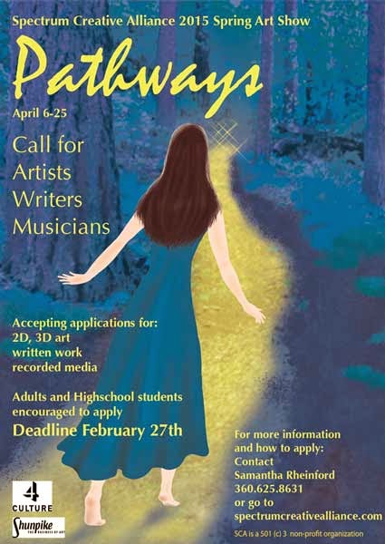
A local arts organization that I'm currently involved with needed a flyer for their month long art show. It was called "Pathways". This flyer I wanted to have a more organic feel and give the impression of fine art. In my photo library, there was an image of a forest with a path going through it. I wanted the path to go from left to right so the image was flipped in photoshop. I wanted rich color in cool tones and the path to stand out. Hue and saturation were used to bump up the color and a color overlay which resulted in an over all purple. The path was painted in yellow and a mask was used to bring it out. The woman was hand drawn in photoshop.

This was actually the second flyer I did for the group. The first was a call for artists and was in blue. I used a color overlay to change the color to purple.

This is the background image I used.
Call for Artists and the art exhibit flyers


And here it is without the text and logos. I think it stands on it's own as digital art.

Wednesday, April 1, 2015

Once Upon a Logo

I finally have a logo of which I am pleased. It only took about 4 years and several iterations.
My business was started during the last year of college and one of the class assignments included creating a logo and website. I wanted to play off the name Left of Center Graphics and came up with this. Gold and yellow gold were used because they are often associated with money and coins.

My instructor said it looked like an olive.


Yep, it does.


I tried this.


Bleh.


Then I played around some more in Illustrator. The goal was the same, playing off the name Left of Center Graphics, using green and gold for money, but adding the beech leaf for prosperity. 


Two different versions were created and I decided, although these were more interesting, both were too busy.  


Then I tried this.


Too gimmicky. Maybe I’m over thinking this.


I thought “keep it simple stupid” and tried this.

The design started in black and white and then I tried color. The gold was too yellow and was hard to see when in print.

Simple…but…boring. I liked the simplicity but it needed more interest.


While designing a client’s logo and playing around with a metallic look for them, I thought why not make the gold color look more like metal, give it shine? Now the logo looks like it's being transformed. The result is this design. 

The feedback has been that it looks professional and something a corporation could get behind.


A grayscale version was done and I’m mulling over whether I should add more contrast or leave it. The soft grays are nice. To see more of my work visit my website: