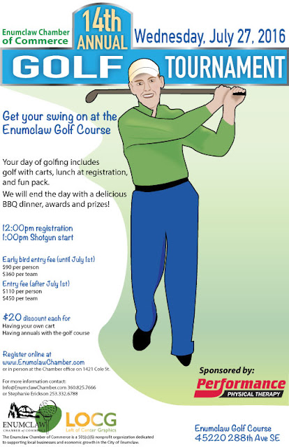
Golfing and design - who would have thought they would go
together? Of course they do when you have a golfing tournament to advertise.
That’s what the Enumclaw Chamber of Commerce needed for their 14th
Annual Golf Tournament.
A good event poster needs three elements.
- Information
- Visuals
- Easy to Read and Understand
Information
Date, time, location, and cost are the next pieces of information
in priority. What to expect at the event, what participants get for the price
of registration or ticket, discounts, sponsors, and who is putting on the
event, is information often included on event posters. But the priority of
information is dependent on the client.
Visuals
This was the third poster I created for this event. The first had a pastoral scene of a golfing green. The second included an image of the restaurant/clubhouse where the tournament would take place. Both had the sponsor prominently displayed within a golf ball.
This time I took a swing at their tag line “Get your swing on at the Enumclaw Golf Course.” There’s the golfer in mid swing and grinning at the viewer. It’s the largest image on the poster.
Easy to Read and
Understand
Breaking up the text into bite size pieces rather containing most or all in a paragraph will encourage people to read the poster. Size of the font, placement of the text, the type of font used, and font color can all be used to draw the viewer’s eye to date, time, cost, etc. and make the poster easy to read.

No comments:
Post a Comment