Monday, September 21, 2015

Recycling and Graphic Design

In online discussions, I've seen people question the reason for retaining the copyright on one's own work. Besides the obvious reason that the work is yours there is the ability to reuse assets. Recycling saves time.

One of my clients sponsors two wine walks a year. Grapes, grape leaves, a wine glass, and sometimes a bottle are used in the posters. Many of these assets I have reused several times which cut down on time and labor. 

When I sat down and thought about this year's Fall poster, I realized I didn't want to have the same look. Sure, I wanted to reuse the assets but wanted a different design. Doing the same thing over and over again can be boring, the passion ebbs, and the work can suffer, get sloppy. This is a dangerous attitude for a designer. If you ever find yourself feeling this way about a design step back from it and Do. Something. Different.  

Everyone represents red wine in wine walk posters including me. Red is a commanding color and can easily be used as a focus. But the wine walks feature red and white wine. Why not use white wine for the poster? Why not white grapes and white wine in the glass? 

What about going for a different appearance? I decided to emulate one of my favorite art styles, Art Nouveau. 

I looked again at images of grape leaves and wine glasses. I especially looked at white grapes and white wine in a glass. And a lot of Art Nouveau posters were perused. 

The wine glass was first used in the Spring Wine Walk poster of 2014, again for the Fall, and again for the following Spring. I liked it quite well and decided to keep it but change the color. 


Note the grapes, grape leaves, and vines in the 2015 Spring poster. These I used in the new poster.

One of the grape leaves I blew up, changed the dark green to more of a yellow green with shading, and added more detail. One grape was copied into the new poster. The red was replaced with a yellow green and the highlight was blurred a little. Then it was saved as a symbol and copied over and over again. 

The wine glass was the most challenging. It needed to be clear yet show there was white wine in the glass. 

A lot of gradients and blurs were used overall in the design. The wine glass, grape leaf and grapes were outlined. A heavier stroke was used on the wine glass to help it stand out. 

The end result was well received. The client said it looked very elegant which is what they especially wanted for this Fall's advertising of the event.

Tuesday, August 25, 2015

And Now for Something Completely Different

Village Tutors is a worthwhile organization that helps youth with academics: reading, writing, arithmetic, spanish, and school projects. Grade K-12, teenagers and young adults can get help a couple of days a week.

A woman for which I did a business card design donated money to the organization so they could hire a graphic designer to rebrand their homework assistance program. She recommended me. They wanted to rename the program from Village Tutors to The Homework Club.

Although the majority of the kids, at this time, are K-12, they also wanted to catch the interest of teenagers. What would be the sweet spot for the various age groups? I started thinking about anime, graphic novels, and comic strips. Perhaps have the poster tell a story in comic strip style?

First I took several pictures of the interior and exterior of the building where the tutoring/homework assistance takes place. Then I spent a couple of days observing the comings and goings of the kids and tutors, and how the place operated.

I also had to keep in mind that they wanted 2 sizes: 8.5x11 and 11x17 for print and one for the web. When I design for print and web I always design in CMYK. Converting CMYK to RGB is easy. But converting RGB to CYMK has it's problems; one of which is the loss in color quality. There can also be problems with the use of mesh and gradients. 

I offered two options to the Village Tutors representative. One was a regular type of poster and the other was the comic strip style.

They loved the comic strip style. All the figures were drawn and added to the photos in Photoshop. The photos were placed in Illustrator where effects were added to make the photos look more like drawings. All the dialogue and information were added in Illustrator.

With any design offered to the client, there are usually changes. The final will often be different than the comp or draft. In this case the client wanted all the characters to be drawn instead of using photographs of people. The only photographed character was replaced with a drawing. They wanted the girl to be more upbeat rather than resisting help and they wanted the font size for The Homework Club information increased. One suggestion to accomplish increasing the size of the font was to eliminate a couple of the panels. I assured them I could increase the size of the font without having to eliminate any panels.

The two images below are the final products approved by the client. As you can see, there were slight adjustments between the 11x17 and 8.5x11.

11x17
8.5 x 11
I enjoy all the projects I work on but this one was one of the more enjoyable efforts I've done. Doing something completely different is exciting, fun, and can stretch your imagination.

Wednesday, April 29, 2015

Spring Art Show

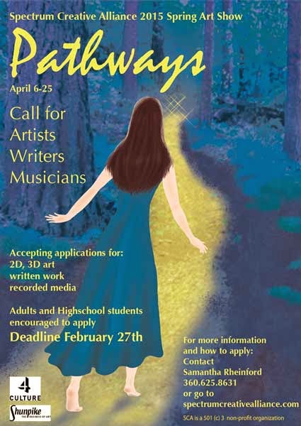
A local arts organization that I'm currently involved with needed a flyer for their month long art show. It was called "Pathways". This flyer I wanted to have a more organic feel and give the impression of fine art. In my photo library, there was an image of a forest with a path going through it. I wanted the path to go from left to right so the image was flipped in photoshop. I wanted rich color in cool tones and the path to stand out. Hue and saturation were used to bump up the color and a color overlay which resulted in an over all purple. The path was painted in yellow and a mask was used to bring it out. The woman was hand drawn in photoshop.

This was actually the second flyer I did for the group. The first was a call for artists and was in blue. I used a color overlay to change the color to purple.

This is the background image I used.
Call for Artists and the art exhibit flyers


And here it is without the text and logos. I think it stands on it's own as digital art.

Wednesday, April 1, 2015

Once Upon a Logo

I finally have a logo of which I am pleased. It only took about 4 years and several iterations.
My business was started during the last year of college and one of the class assignments included creating a logo and website. I wanted to play off the name Left of Center Graphics and came up with this. Gold and yellow gold were used because they are often associated with money and coins.

My instructor said it looked like an olive.


Yep, it does.


I tried this.


Bleh.


Then I played around some more in Illustrator. The goal was the same, playing off the name Left of Center Graphics, using green and gold for money, but adding the beech leaf for prosperity. 


Two different versions were created and I decided, although these were more interesting, both were too busy.  


Then I tried this.


Too gimmicky. Maybe I’m over thinking this.


I thought “keep it simple stupid” and tried this.

The design started in black and white and then I tried color. The gold was too yellow and was hard to see when in print.

Simple…but…boring. I liked the simplicity but it needed more interest.


While designing a client’s logo and playing around with a metallic look for them, I thought why not make the gold color look more like metal, give it shine? Now the logo looks like it's being transformed. The result is this design. 

The feedback has been that it looks professional and something a corporation could get behind.


A grayscale version was done and I’m mulling over whether I should add more contrast or leave it. The soft grays are nice. To see more of my work visit my website:

Thursday, July 31, 2014

Event Posters

I was asked to create a poster for the annual golf tournament. They wanted their logo at the top with their organization's name. The prominent sponsors needed to be highly visible. And they wanted a map showing cross streets for newcomers to the area. I figured a golf ball would catch the eye of golfers and used that image to highlight the two sponsors. I wanted to give a sense of distance and thought of photographs where the focus is in the foreground. To get a similar effect, I used Effect/Blur/Gaussian Blur for the background layers.

It gets to be a challenge when there is a lot of information included on the poster and a lot of sponsors. You have to decide on the priority of the information but the client should be providing input on priority. The mistake would be to try to make everything of equal importance then there is no focus. The poster ends up looking cluttered or confusing. I've seen posters that looked like all the information was yelling at you, competing for attention. Then I've seen posters where sponsor logos took up half of the space. Logos don't have to be huge; just big enough to be visible and recognizable.

Event posters need the following information:
  • The organization responsible for the event
  • The name of the event
  • Date, time and hours
  • Location
  • Contact information - this can include a website, address, phone number, Facebook page or other social media pages
  • Sponsors - usually listed at the bottom of the poster
  • Other information pertinent to the event such as registration fees, ticket prices, early bird specials, a map, a brief description of the event, this information depends on the event and what information the client wants on the poster
  • Sometimes a QR code is added

This poster was created in Illustrator.