Wednesday, October 3, 2018

On the Campaign Trail


This year, I had the opportunity to create some campaign materials for a local candidate. What was created for her were a Facebook cover, logo, and a campaign sign. She wanted to give the message that they would represent everyone in their district regardless of party affiliation. She wanted blue, red, and purple. I thought of using a map of her district in either her sign or logo or both. 

The logo was created and approved first. The approved design was provided in full color and gray scale for print; full color for social media. 


By the time we got to her sign she had decided on red, white, and blue for the colors and ultimately, instead of the standard rectangular sign, she wanted a round shaped sign.

People often don't know how many iterations of a design are considered before a decision is made. The complete and final design can appear so simple like the Nike swoosh and people wonder what all the fuss is about. 

Here are several iterations of the campaign sign before approval.


Sign that was approved. When a design for print has been approved, I like to work with the client's chosen printer to get the printer requirements. I've done posters, business cards, brochures, and banners. Sometimes the printer wants a pdf and sometimes they want the native file. In this case, the print shop wanted the native file with "create outlines" using the PMS color system. 


The Facebook cover was the last item created, using a photo supplied by the client and a similar theme to the campaign sign.


The whole project took about 4 months from contract to completion.

Friday, July 21, 2017

You Don't Have to be a Professional to do Our Posters

Recently, I had a client, who, in all seriousness, told me that you don’t have to be a professional to do their posters.

Huh.

I thought about a project I completed last year.

It was an event poster for a winter concert, Christmas songs that were all about journeys – Mary and Joseph traveling to Bethlehem, families traveling to visit relatives.

The organization’s representative was in a quandary on how to represent the spiritual and secular journey on the poster. They suggested just do text and no graphics because they couldn’t think of how to visually both. They didn’t think that splitting the poster in half with an image of Mary and Joseph on one side and a family’s journey on the other would work. I explained that you don’t have to be that literal. We talked about the theme “The Journey”. They talked about some kind of movement or sense of movement, perhaps a comet? Maybe a visual of a snowy path through a winter woods would work? I responded with “Let me see what I can do.”  

Thinking about the title of the concert “The Journey” and what a journey means, I thought that the message for this concert isn’t about the journey but the destination. What I came up with captures that sense of journey to a place while at the same time giving the feeling of something beyond the physical world.

And this takes me back to “you don’t need a professional…” I put it like this: clients have limited tools in their toolbox. They might use bullet points, italics, or bold to highlight text. They might use clip art and center everything. The basics of graphic design and having an eye for composition isn’t there. The ability to see any number of possibilities to visualize their message isn’t there.  

When a client expects the designer to do what they are told then they are not allowing the designer to do their job and the possibilities are lost.

A professional will think and imagine something the client would never think of. Telling the client that they don’t know what they are doing is problematic. Explaining that this isn’t their area of expertise; that it’s the designer’s job to come up with solutions can be misunderstood. Depending on the client, this could come across as having a big ego.

But if I had done what I was told, the first idea presented to me, the client would have had a poster with only text and a logo. They wouldn’t have a poster that they loved and caught the attention of the public.

“You don’t need a professional to…”

Then you don’t need a graphic designer or commercial artist.

Wednesday, November 30, 2016

Freelancing and Marketing

I believe the hardest part of being a freelancer is marketing oneself. I know I would rather be concentrating on the creative work, designing dynamic and engaging websites, brochures, business cards, and posters for clients. But in order to do the work for clients you have to get clients and that means selling yourself.

I asked my contacts on LinkedIn for tips that would help freelance designers. Feedback came from recruiters, fellow graphic designers, design firms, and marketing experts.


The tips and suggestions given I’ve broken down into three categories.
Branding/Identity/Message
Networking
Services

Branding/Identity/Message

This would be whom you are and what you offer that others don’t. It’s how you present yourself to the world online and in person. Some people call it “your story”.

Sammie Watson (Aesthetic Designs of Cherry Creek) talked about utilizing your background.  “I would say marketing yourself comes down to knowing your own strengths and weaknesses, your past experiences that made you who you are, and knowing how to shine all of this in a positive light that appeals to those you are marketing to.” She goes on to say that in order to target your audience you need to listen and know what they want; you need to be able to relate to them.

Kimberly Myers (CWDP, Outreach & Resource Specialist at WorkSource Pierce) said “Have a consistent and focused message… Everything you put out there about yourself has to agree with that message.”

What my sources stressed was decide to whom you are marketing, understand what skills, experience, and training meet your audience’s needs, and craft a consistent message.

·      Know yourself
·      Know your audience
·      Provide value to your audience
·      Be consistent in your message

Networking

Networking involves building business relationships whether in person or online. These relationships are professional business connections and in establishing them you can also establish your reputation. Focus on what you can do for their business and be willing to refer them to others.

Networking with your targeted clientele is a little different than networking with people in your industry. The former allows you to learn about their business (this would be part of the research in understanding your client’s needs) and present yourself as a reliable and talented commercial artist. Again, the focus should be on what you can do for them. The latter provides opportunities of knowledge sharing and connecting with people that can assist with your projects.

Bill Kaufmann, MBA, recommended rotary clubs and chambers of commerce for connecting with other businesses.

Conferences within your own industry and your targeted audience can also provide contacts, information, and resources.

Marcus M (graphic designer, Lenz Do This Studio) said he networks with random people. In other words, talking to people throughout your day. He also said that most of his work has been obtained via word of mouth. This has been my experience, which highlights the importance of networking.

Find social media sites that are business centered. LinkedIn is a good example. Participate in online groups within your industry and your targeted audience and share your expertise. Getting involved in discussions, answering questions, offering help, and asking questions increases your visibility.

Rusty George (Rusty George Creative) advised becoming a thought leader.  “... become a thought leader in one area and write about it so that clients will come to you about and pay you for what you know (expertise) instead of what you do (being a vendor). The more respect they have for you the more you make.”

Writing a blog can help in becoming a thought leader online. What can be effective is posting regularly and sharing those posts across your various social media outlets.

Services

What can you offer your client? What services can you provide that will help their business?

Marcus M (graphic designer, Lenz Do This Studio), recommended finding a niche. “Focus on one thing and then branch out.” He had started with tattoos and piercings, then expanded to photography for realtors and later added promotional videos.   

He suggested canvassing. Use the good old fashion legwork of going from door to door and talking to business owners. What he did was look at their businesses, recreate their signage, logo’s, or branding and presented them as samples of what he can do for them.

In Conclusion

It takes a lot of effort to build your business as a freelancer but the results are rewarding. I hope the tips I’ve shared here are useful. 

Wednesday, May 25, 2016

Golfing Gets a Swing with Design

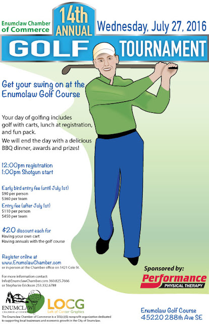
Swinging Golfer

Golfing and design - who would have thought they would go together? Of course they do when you have a golfing tournament to advertise. That’s what the Enumclaw Chamber of Commerce needed for their 14th Annual Golf Tournament.

A good event poster needs three elements.
  1. Information
  2. Visuals 
  3. Easy to Read and Understand
Information

The most important information is letting people know what the event is all about. That would be the event name and in this case “14th Annual Golf Tournament” is the largest font on the page. The client wanted the Golf Tournament to be prominent, considering “14th Annual” a secondary consideration. This was done by using a different color and font size for “Golf Tournament”.

Date, time, location, and cost are the next pieces of information in priority. What to expect at the event, what participants get for the price of registration or ticket, discounts, sponsors, and who is putting on the event, is information often included on event posters. But the priority of information is dependent on the client.

Visuals

Visuals should capture the attention of the intended audience. In this case it would be people who enjoy golfing. Any number of images whether graphics, photos, clip art, or illustrations, can be used as long as the design doesn’t look cluttered and busy. They can be used to highlight information or direct the viewer to text, logos, and other images.

This was the third poster I created for this event. The first had a pastoral scene of a golfing green. The second included an image of the restaurant/clubhouse where the tournament would take place. Both had the sponsor prominently displayed within a golf ball.

This time I took a swing at their tag line “Get your swing on at the Enumclaw Golf Course.” There’s the golfer in mid swing and grinning at the viewer. It’s the largest image on the poster.

Easy to Read and Understand

People should be able to find information easily. I’ve seen some posters where I had to hunt for the date, time, and location. Sometimes, I’ve been hard pressed to find what the event is about.

Breaking up the text into bite size pieces rather containing most or all in a paragraph will encourage people to read the poster. Size of the font, placement of the text, the type of font used, and font color can all be used to draw the viewer’s eye to date, time, cost, etc. and make the poster easy to read.

Keeping these three elements in mind will help you create successful posters for your clients.